![]()
|
Andy Warhol When it comes to influences in my artwork, there is probably no more important one than Andy Warhol. I grew up in a generation that was saturated in his images and mystique. There are a lot of differences between my work nowadays and Andy's paintings, but I see and feel the influence very strongly.
|
|
|
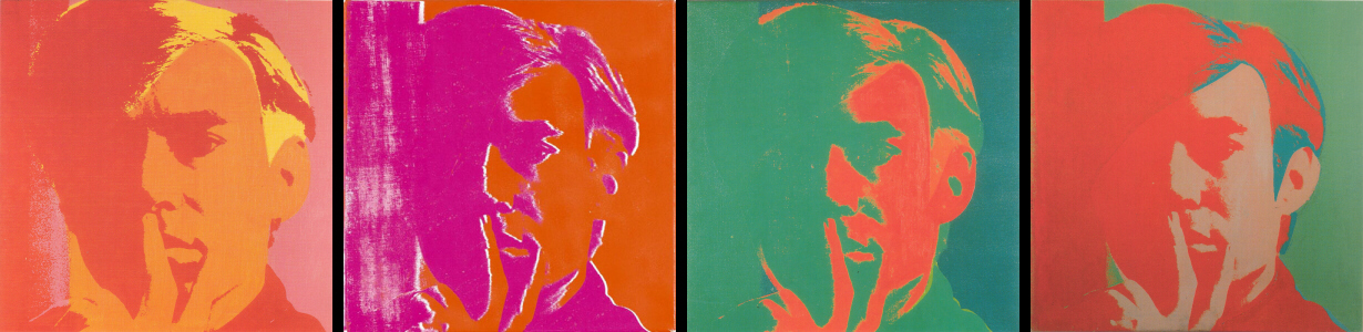
Warhol was an amazing
colorist. He was bold in his experimentations with combinations
that were very far from the norm. Traditionalists will tell their
art students "darker darks and lighter lights." A
painting should (theoretically) run the spectrum from white to black,
with all the colors necessary within. Warhol developed from early
works of ink on paper to adding washes of watercolor
on top of those same ink drawings. The evolution that follows is
fascinating. The lines he used in his original ink works reappear
until the very end of his career. They are adjusted to his need
and interestingly, the last works he did in his lifetime are large scale
paintings using the same techniques he began with. An artistic
style brought full circle.
|
|
|
|
|
|
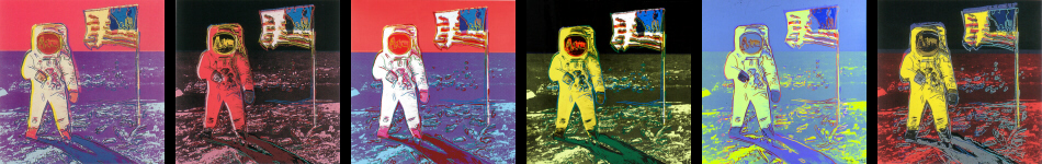
His experimentation in color combinations can be seen to the best advantage when examining his works on paper. When Warhol was creating editions he made multiple versions of the same image and then chose the combination that worked best. Below you can see six of these. The variations on a theme in a portfolio were called "trial proofs." The work here is Moonwalk.
|
|
|
|
|
Not only does he vary the color structure, but with each version he alters the elements of shape and line that compliment the entire image. There are some art historians that still argue that Warhol's work was a sham because of his use of silkscreen. When I see works like this and the the thought that is so apparent in them, I cannot help but argue otherwise.
|
|
|
|
|
|
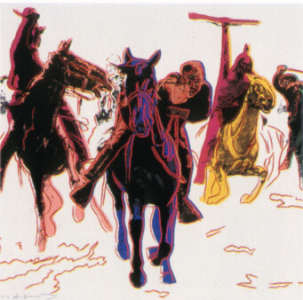
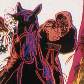
The work above is from Warhol's Cowboys and Indians portfolio. It's a really good example of his use of line as a major element in his work. What is originally a somewhat vague and pointless image becomes far more dynamic with the added emphasis of the line. It allows him to direct the viewer's eyes to exactly where he wants you to look. It brings definition to darker areas (such as the horse's head) and suggestions of elements that are not clear (in this case, the shadows of the horses and the ground in general). In my earliest works I used this kind of line work to define things. Although I don't outline things like that anymore, I still use line as a major element in my work in so many different ways.
|
|
![]()